It’s time for the final leg of this journey you and I have been traveling down over the past few weeks. And I’m excited to see what you create after you read this last post in the series.
Did you miss the first two posts? No problem. Check out these links and come back to this post when you’re done:
This tutorial is the capstone of all the hard work you did in the first two lessons. You started by learning how—and why!—to use the WordPress scripts package in your theme. Then you designed some custom icon styles for the Separator block. And in that process, you hit some limitations of the Block Styles API.
So let’s kick this thing up a notch and build the custom editor control that will let your users assign an icon to the Separator block.
You can snag the final code for this tutorial from the part-3 branch of the Beyond Block Styles GitHub repository. I recommend using it only as a supplement to this tutorial.
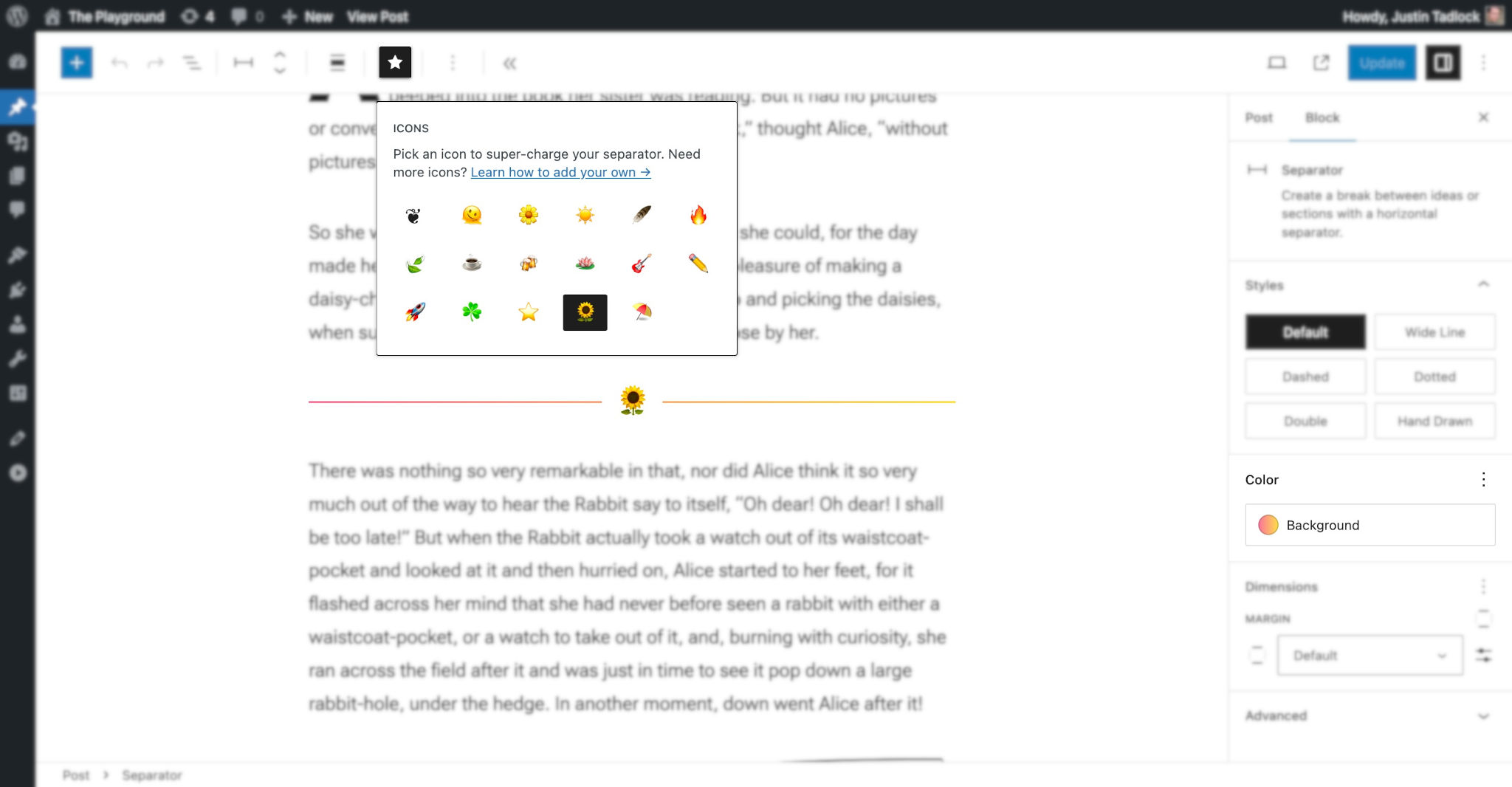
Remember that this is what your final product is going to look like:
Separator block icon control with gradient background.
Table of Contents
Getting started
At the end of Part 2, I asked you to delete all the code from your /resources/js/editor.js file but keep all of the other code you added. If you didn’t do that then, please do it now.
Start by adding a couple of empty JavaScript files under the /resources/js folder named control-icon.js and util.js. Remember, it’s good practice to break your code down into chunks that are easier to work with.
After you added the above files, your /resources folder structure should look like this:
/resources
/js
const.js
control-icons.js
editor.js
util.js
/scss
editor.scss
screen.scss
Now install the WordPress icons library. Conveniently, it’s a package you can install with a single command, as we did before with the scripts. To do that, open your favorite command-line editor and navigate to your theme folder. Then enter this command:
npm install @wordpress/icons --save-dev
Now you can use the WordPress icons library in your scripts. You’ll need it later, when you add a toolbar icon.
It’s time for the really exciting part: building a custom icon picker for the Separator block.
Don’t forget to enable watch mode so that webpack compiles your code:
npm run start
Creating a custom control with JavaScript
This is the biggest part of this tutorial series.
Is this your first time writing JavaScript for the WordPress editor? Congratulations and welcome!
There’s no rush. So take your time as you work through this article, and do yourself a favor when you see the links sprinkled throughout: go ahead and click, then read the information there in real time.
Register a gradient for each icon
In Part 2, you defined a custom set of icons within the /resources/js/const.js file, which should look like this:
The icon picker automatically sets a gradient background to the Separator block based on the selected icon. This means each icon needs a gradient preset assigned to it ahead of time. You can use the presets defined in your theme.json or the ones in the default WordPress theme.json. All you need is the gradient’s slug value.
Now add a new gradient property with a preset value for each icon object in your const.js file:
The icons above use the gradient presets from the WordPress theme.json file. If you do not define a gradient for an icon, it will fall back to a solid color. You defined that color in the CSS you wrote in Part 2.
Write some utility functions
Before you build your actual control, you need to write a couple of custom utility functions. You’ll store them in the new /resources/js/utils.js file you added at the beginning of this piece.
Start by adding your dependencies to your new utils.js file. Those are the ICONS array from your const.js file and the WordPress TokenList package:
// Internal dependencies.
import { ICONS } from './const';

// WordPress dependencies.
import TokenList from '@wordpress/token-list';
The first utility function you will need will get the value of the icon assigned to the Separator block.
The way you do that in a theme is significantly different from the way you’d do it in a plugin.
Here you’re building a feature for a theme, so you want to avoid adding custom block attributes. Plus, you already have a className attribute—which is precisely what the Block Styles API uses. So use that, and know that you’re already complying with a subset of the WordPress.org theme review guidelines.
Now add a function named getIconFromClassName() to your utils.js file:
This function creates a DOM token list of classes by passing the className variable into TokenList. Then, it searches for a class containing one of the icon values. If found, it returns the value for the icon. Else, it returns an empty string.
You will also need a function for updating the block’s className property that does not interfere with the Block Styles API or erase any CSS classes that a user might input from the UI (tip: you can find all custom classes in the Additional CSS Class(es) field under the block’s Advanced tab).
Now add the updateIconClass() function to your utils.js file:
Again, this function uses the TokenList function to make a list of class names. This makes it easy to target classes related to icons, removing the old icon class and adding the new.
We talked about putting utility functions in the utils.js file. Store all your common functions there—I do.
Here, you’re writing these functions specifically for the icon picker. But in a real project, I very often make these files reusable across several components. So, for instance, I’d change updateIconClass() to the more generally useful updateBlockClass().
Building a custom control
Don’t you hate it when the prep work takes so long you start to think the real work will never happen?
Well, we’re finally done with the prep work. Let’s build that control!
When you’re building controls for the editor, I strongly recommend the Storybook tool for WordPress. It takes a lot of the heavy lifting out of selecting the right components and building the code. I used it heavily to pull together the code for this icon picker.
Now open your newly-created /resources/js/control-icons.js file. As usual, you’ll need to import several constants and functions you’ve created and a few things from WordPress, mostly components:
// Internal dependencies.
import { ICONS } from './const';
import { getIconFromClassName, updateIconClass } from './utils';

// WordPress dependencies.
import { __ } from '@wordpress/i18n';
import { starFilled } from '@wordpress/icons';

import {
	BaseControl,
	Button,
	Dropdown,
	ToolbarButton,
	__experimentalGrid as Grid
} from '@wordpress/components';
We’ll be using the __experimentaGrid component to lay the icon button out into a grid. It’s not best practice to use experimental components in production, because they could have backward-incompatible changes in the next WordPress release.
If you do not feel comfortable with experimental features, you can recreate this component’s layout with a <div> and some custom CSS for the grid—totally up to you.
Other than imports, the control-icons.js file will contain one function, which will be its default export. Go ahead and add this:
This function destructures the props parameter, giving you attributes (an object that houses the block’s attributes) and setAttributes (a function that sets the block’s attributes). The attributes parameter is further destructured to give you access directly to the className attribute. Read more about attributes in the Block Editor Handbook.
I would rather not just dump a massive blob of JavaScript for you to copy and paste. Instead, let’s walk together through each of the next steps. You will put all new code from this section of the tutorial inside the function above.
Let’s start out with an easy code snippet.
You need a variable with the currently-assigned icon for the Separator block. So pass the className attribute to your custom getIconFromClassName() function (the one you defined in utils.js):
// Get the current icon.
const currentIcon = getIconFromClassName( className );
Now you need a function that updates the block’s attributes when a new icon is set. It will do two things:
Update the block’s class, which is handled by the updateIconClass() function you defined in utils.js.
Update the block’s gradient attribute.
The values for both of these get passed into setAttributes().
Now add the code for the onIconButtonClick() function:
