Mobile Toolbars
From Xojo Documentation
Contents
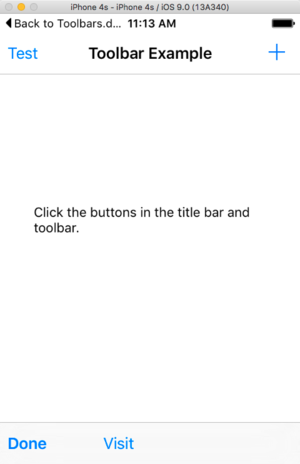
A view can have a Navigation Bar, which displays at the top of the Screen, or a toolbar which displays at the bottom of the Screen. In a horizontally regular environment, a navigation bar can also display within a Screen that doesn’t extend across the display, such as one pane of a split view controller.
To add a Toolbar Button to the Navigation Bar, drag a Toolbar Button from the Library to the the top part of the Screen. If the Navigation Bar is not visible, then the NavigationBarVisible property will automatically be turned ON. Tool Buttons can be added to the left or right side of the Navigation Bar.
To add a Toolbar Button to the Tool Bar, drag a Toolbar Button from the Library to the bottom part of the Screen.
You can also add Toolbar Buttons to a Navigation Bar or Toolbar via code as shown below. Refer to Handling Toolbar Button Presses to determine what toolbar button was pressed.
To display the Navigation Bar, set the HasNavigationBar property to True. You can do this in the Inspector for the Screen or in code, usually in the Opening event handler for the view:
Buttons can be placed on the left side or right side of the Navigation Bar. To add buttons, use the LeftNavigationToolbar and RightNavigationToolbar properties. These properties return a toolbar (MobileToolbar) which has several methods you can use to add the buttons. Typically you will set up the toolbar in the Opening event handler of the view. This code adds a save button to the right navigation toolbar:
Breaking this command apart, you can see the AddButton method of MobileToolbar is called to add the button. The AddButton method has a parameter for the button (MobileToolbarButton) to add. The button is created by calling the New operator, indicating MobileToolbarButton which calls its constructor it's being told to create a Save type button with the caption "Save".
With the MobileToolbarButton class you can create different types of buttons (and spaces). You can create buttons with a text caption or with an icon, but not both.
If you are using an icon, note that only the mask of the icon is used. Multicolor icons are not used on iOS, so the mask is used with the standard OS tint color applied to it. Toolbar icons should be a maximum of about 66x66, but you can refer to the Apple Docs on Icon Sizes for more information.
This example adds a button using an image that was added to the project:
b = New MobileToolbarButton(MobileToolbarButton.Types.Plain, ButtonImage) // ButtonImage is an image in the project
LeftNavigationToolbar.AddButton(b)
You can also add buttons that use one of the default system images. Use the MobileToolbarButton Types enumeration to choose the system icon you want to use. This example adds a button using the Refresh icon:
Var button As MobileToolbarButton
button = New MobileToolbarButton.(MobileToolbarButton.Types.Refresh)
// Add it to the Screen
RightNavigationToolbar.AddButton(button)
Toolbar
To display a toolbar (which appears at the bottom of the Screen), add buttons to it using the Toolbar property of the Screen the same way you did with the Navigation Bar properties above. This example adds the Add button to the toolbar:
Handling Toolbar Button Presses
You use the ToolbarButtonPressed event handler to check which toolbar button was pressed. This event handler is called for toolbar buttons that are pressed on either the Navigation Bar or the Toolbar. You are supplied with one parameter, which is the button that was pressed. You can then check this button to determine what was pressed so you can call the appropriate code.
This code checks to see if a system button was pressed and if not, then checks the caption of the button to see what was pressed:
Case MobileToolbarButton.Types.Edit
// Edit
Case Else
Select Case button.Caption
Case "Report"
// Show report
End Select
End Select
If you've added toolbar buttons using the Layout Editor, you can more easily check which button was pressed by using its name. For example, if you have an EditButton and a SaveButton on the Navigation toolbar, you can check to see which was pressed with this code:
Case EditButton
// Edit was pressed
Case SaveButton
// Save was pressed
End Select
Toolbar Organization
Regardless of which toolbar you are using (Navigation Bar or Toolbar), you can control the buttons and their positions. For the Navigation Bar, keep in mind that you do not have a lot of room to work with (since the Screen title appears in the center) so only a few buttons can be displayed on each side. With the Toolbar, you have the entire width of the device, so you have more flexibility.
The examples above all used the AddButton method of MobileToolbar to add buttons. This adds buttons from left to right, with the new button appear to the right of the last button added.
You can also use the AddButtonAt method to add a button at a specific position. You can also remove all the buttons at once or remove individual buttons (RemoveAllButtons, RemoveButtonAt).
In addition to adding buttons as shown above, the MobileToolbarButton class lets you add two types of special "space" buttons: FixedSpace and FlexibleSpace. These are not actual buttons since they cannot be clicked but they do take up space on the toolbar. They are used to give your buttons separation or to force some buttons to always appear on the right side of the toolbar.
See Also
MobileToolbar, MobileToolbarButton, MobileScreen classes

