Mega menus are widely used in web design, and with the advent of block themes, I’ve been looking for a way to incorporate them seamlessly into WordPress’s Navigation block. The upcoming release of WordPress 6.5 at the end of March includes features like the Interactivity API that will help finally bring block-based mega menus to life. In this article, I’ll walk you through one approach using these new tools.
Now, only some sites need a mega menu. If this tutorial doesn’t seem relevant to your workflow on its surface, I still encourage you to give it a read. The article is more about architecting a block plugin using new functionality in WordPress 6.5. Many concepts we will cover apply well beyond mega menus. Here are a few examples:
How to create custom template part areas
How to add custom blocks to the Navigation block
How to set up a project that uses the Interactivity API
How to use Core components to streamline block development
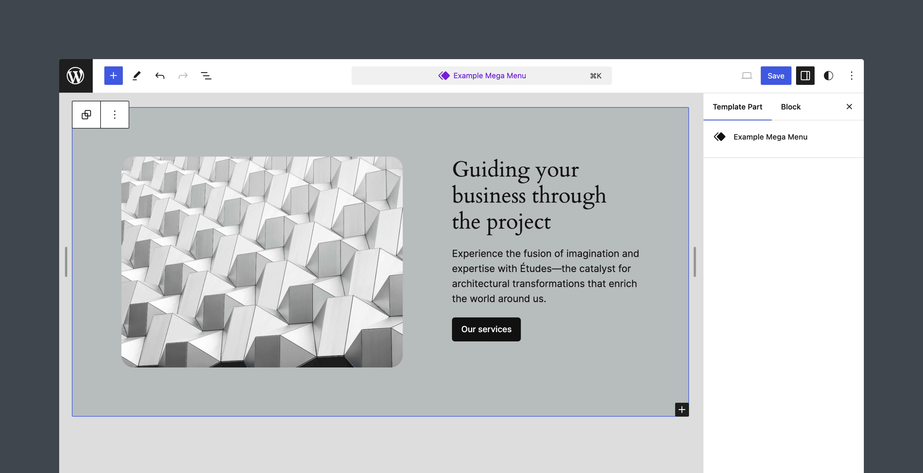
Before diving in, here’s a look at the result using the Twenty Twenty-Four theme. We’ll not be building a production-ready block to keep this article from going too long, but it will provide a solid foundation for continued iterations.
Table of Contents
The approach
There are many approaches you could take when building a Mega Menu block, so before we begin, let’s look at the prerequisites I had when structuring this project.
The Mega Menu block needs to integrate directly with the Navigation block
It should be the same experience as adding any other link
Once a user adds a Mega Menu block to the Navigation block, they then choose from a list of available “menu templates” to display on the front end
Menus themselves are template parts
Menu template parts are created and designed in the Site Editor
I took as much inspiration as possible from Core, and the resulting block closely resembles the Navigation Link block. The more the block feels like native WordPress, the better.
Getting set up
The first step is to scaffold a block plugin using the @wordpress/create-block package. I’m not going to go into too much detail here, but you can refer to the Getting Started documentation to learn more about this process.
The following command will create a plugin that supports using wp-env and registers the dynamic block mega-menu-block. Feel free to use your preferred plugin slug and local development environment; wp-env is not required. You just need to make sure you’re running WordPress 6.5.
npx @wordpress/create-block@latest mega-menu-block --variant=dynamic --wp-env
cd mega-menu-block
Throughout this tutorial, all edits will be made to the files in the plugin’s /src folder unless otherwise indicated.
Adding a custom template part area
Before configuring the block itself, let’s register the template part area that will house each mega menu. You can add custom areas using the default_wp_template_part_areas hook.
/**
 * Adds a custom template part area for mega menus to the list of template part areas.
 *
 * @param array $areas Existing array of template part areas.
 * @return array Modified array of template part areas including the new "Menu" area.
 */
function outermost_mega_menu_template_part_areas( array $areas ) {
	$areas[] = array(
		'area'        => 'menu',
		'area_tag'    => 'div',
		'description' => __( 'Menu templates are used to create sections of a mega menu.', 'mega-menu-block' ),
		'icon'        => '',
		'label'       => __( 'Menu', 'mega-menu-block' ),
	);

	return $areas;
}
add_filter( 'default_wp_template_part_areas', 'outermost_mega_menu_template_part_areas' );
Place this PHP code in the main plugin file in the root mega-menu-block folder. It should be mega-menu-block.php unless you choose a different block slug. Note that the area is set to menu. We’ll use this later in the tutorial.
In your local environment, navigate to the Site Editor. You should see that the “Menu” area is now selectable when creating a new template part.
As of WordPress 6.5, there is no way to assign a custom icon to template part areas. The options are header, footer, and sidebar. Leaving the field blank or specifying any other value will display a default icon, as seen in the image above.
Create a new Menu template part and add some filler content. I chose to insert one of the patterns from the Twenty Twenty-Four theme. Don’t worry too much about what it looks like. We just need a saved template for testing purposes.
Adding mega menus to the Navigation block
It’s now time to start building out the “Mega Menu Block” block, and the first thing to do is ensure users can add it to the Navigation block in WordPress.
Start the build process by running npm start in the terminal. Navigate to a new page in your local environment and confirm that the block is available in the Editor. It shouldn’t look like much yet, just the default block that’s scaffolded by the create-block package.
Now add a Navigation block to the page and try adding the Mega Menu Block in the menu. You won’t be able to.
By default, the Navigation block only permits a predefined set of Core blocks, controlled by an array of block names defined in the block’s allowedBlocks setting. However, you can now add support for custom blocks using blocks.registerBlockType filter in WordPress 6.5.
The filter itself is not new. It loops through each block type and allows you to modify the settings of each, and you may have seen it before in other tutorials here on the Developer Blog. The filter’s callback function accepts two parameters: an object of block settings (blockSettings) and the block’s name (blockName).
To use the filter, start by importing addFilter at the top of the index.js file.
import { addFilter } from '@wordpress/hooks';
Then, add the following code at the bottom of the file and save. The build process should still be running. If not, run npm start in the terminal.
/**
 * Make the Mega Menu Block available to Navigation blocks.
 *
 * @param {Object} blockSettings The original settings of the block.
 * @param {string} blockName     The name of the block being modified.
 * @return {Object} The modified settings for the Navigation block or the original settings for other blocks.
 */
const addToNavigation = ( blockSettings, blockName ) => {
	if ( blockName === 'core/navigation' ) {
		return {
			...blockSettings,
			allowedBlocks: [
				...( blockSettings.allowedBlocks ?? [] ),
				'create-block/mega-menu-block',
			],
		};
	}
	return blockSettings;
};
addFilter(
	'blocks.registerBlockType',
	'add-mega-menu-block-to-navigation',
	addToNavigation
);
Before modifying any settings, it’s important to ensure we only target the Navigation block by checking the blockName. Then, append create-block/mega-menu-block to the allowedBlocks setting. This is the name of the block as defined in block.json.
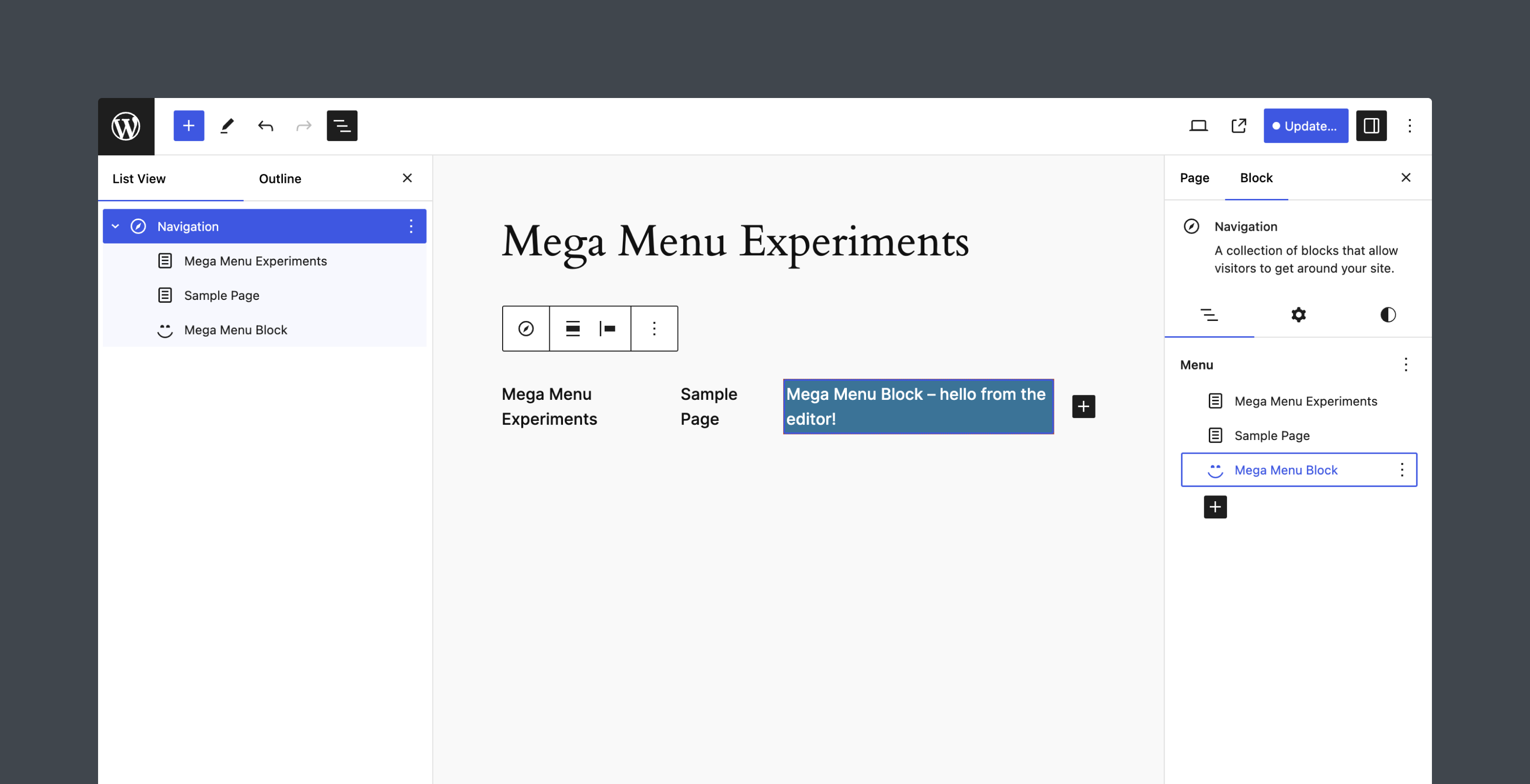
After saving the file and refreshing the page, you should now be able to add the Mega Menu Block to menus.
Updating block.json, block styles, and adding a custom icon
For the sake of this tutorial, I am going to keep the Editor functionality of the Mega Menu Block to the basics. You can always extend it, and I encourage you to do so.
In the Editor, the block requires two features: a way to set a label for the menu item within the Navigation block and a selection mechanism for choosing a menu template part for the mega menu. The label and selected template part data must be stored as block attributes.
We’ll begin by updating the block.json file to include these attributes and do some additional cleanup. Here’s the todo list:
Add an attributes property
Add a label attribute with type string
Add a menuSlug attribute with type string
Add a parent property and set it to core/navigation so users cannot insert the block outside of a Navigation block
Add typography support to match the other link blocks available in the Navigation block
Update the title property to “Mega Menu”
Update the description property to “Add a mega menu to your navigation.”
Update the category property to “design”
Remove the icon property (we’ll add a custom icon later)
The updated block.json file should look like this.
Next, clear out the default styles from the create-block setup by removing all content in the style.scss and edit.scss files. We’ll introduce custom styling later in this tutorial. Remember to save the changes to both files.
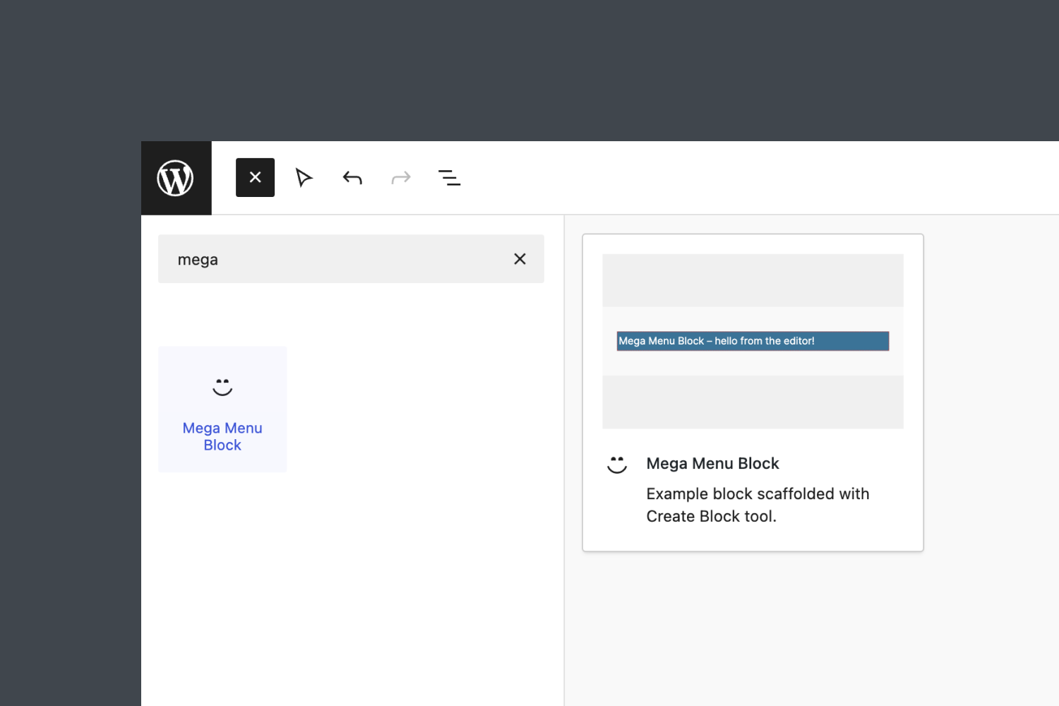
This final clean-up step is unnecessary, but I always like adding a custom block icon. The icon property in block.json allows you to specify a Dashicon slug, but you cannot add SVG icons this way. Instead, let’s add the icon directly to the registerBlockType() function in the index.js file.
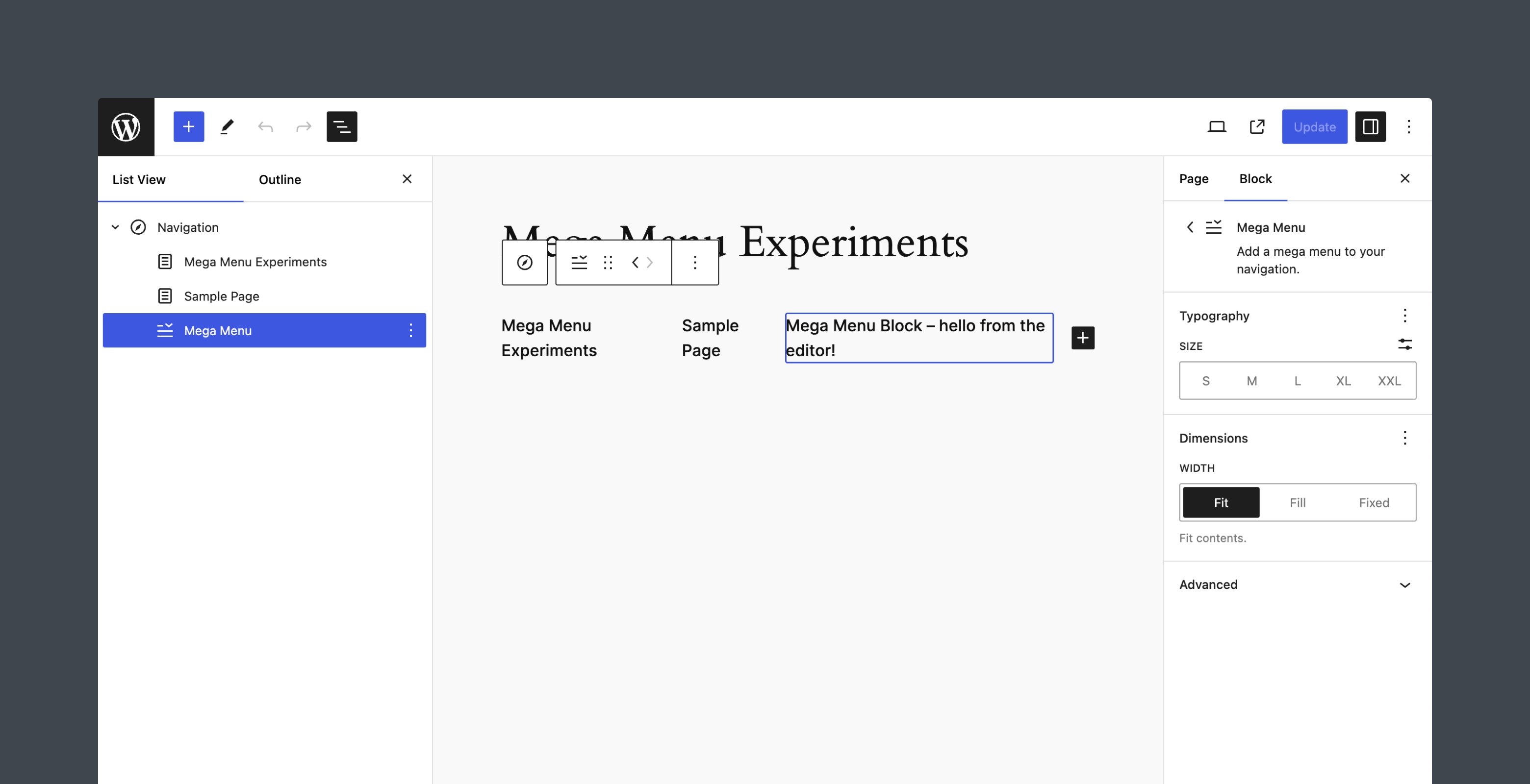
Save the file and refresh the page. The “Mega Menu” block should look like this in the Editor. Notice the Typography panel provided by the block supports.
Adding the Editor user interface
With the initial setup complete, it is now time to add controls to the block that allow the user to set the label and menuSlug attributes.
In the edit.js file, let’s start by updating the Edit component to include the properties attributes and setAttributes. From attributes, extract label and menuSlug. we’ll use setAttributes later to update the values based on user interaction.
Finally, the markup in the Editor defaults to using a <p> tag. Update that to a <div>. The results should look like this.
export default function Edit( { attributes, setAttributes } ) {
	const { label, menuSlug } = attributes;

	return (
		<div { ...useBlockProps() }>
			{ __(
				'Mega Menu Block – hello from the editor!',
				'mega-menu-block'
			) }
		</div>
	);
}
Importing components, hooks, and functions
Next, we need to import a few items that will be used to build the block interface. For the sake of brevity, let’s add them all at once. We’ll need:
InspectorControls: A component that renders block-specific settings in the sidebar.
PanelBody: A component used within InspectorControls to group related UI controls in a collapsible container for better organization.
TextControl: A form input component that allows users to enter and edit text.
ComboboxControl: A combined input and dropdown menu component that allows users to choose from predefined options.
RichText: A component that provides a rich text editing interface.
useEntityRecords: A React hook that retrieves a list of entities (e.g., posts, pages, template parts) from the WordPress database based on specified query parameters.
Update the imports at the top of the edit.js file to include the following.
import { __ } from '@wordpress/i18n';
import { InspectorControls, RichText, useBlockProps } from '@wordpress/block-editor';
import { ComboboxControl, PanelBody, TextControl } from '@wordpress/components';
import { useEntityRecords } from '@wordpress/core-data';
Fetching menu template parts
We’ve included essential imports, and the block now has access to the label and menuSlug attributes. The one missing piece of information is the available “Menu” template parts.
Let’s use the useEntityRecords hook to fetch all entities of the type wp_template_part and then parse the returned records for all template parts with the area menu, as defined earlier in this tutorial. The code should be added before the return statement in the Edit component and should look something like this.
// Fetch all template parts.
const { hasResolved, records } = useEntityRecords(
	'postType',
	'wp_template_part',
	{ per_page: -1 }
);

let menuOptions = [];

// Filter the template parts for those in the 'menu' area.
if ( hasResolved ) {
	menuOptions = records
		.filter( ( item ) => item.area === 'menu' )
		.map( ( item ) => ( {
			label: item.title.rendered, // Title of the template part.
			value: item.slug,           // Template part slug.
		} ) );
}
Note that we can retrieve all records by setting per_page to -1.
The hasResolved variable indicates whether the request to fetch the template parts has been completed. Once the fetching process has resolved (hasResolved is true), the code filters through the records (the fetched template parts) to find those that belong to the menu area.
For each template part in the menu area, the code constructs an object containing the template part’s title and slug. These objects are collected into the menuOptions array, which we’ll then use to represent options in a ComboboxControl component.
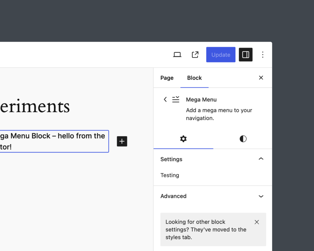
We have all the data needed to build out the settings panel for the block. To do so, let’s start by adding an InspectorControls component within the return statement. Then add a PanelBody component with the title property set to “Settings”. Core blocks generally have setting panels open by default, so set the initialOpen property to true.
The updated return statement of the Edit component should look like this:
In React, a component can only return a single element, which is why everything is wrapped in a Fragment (<>...</>) in the code above.
Save the edit.js file and preview the Mega Menu block in the Editor. You should see a “Settings” panel when the block is selected.
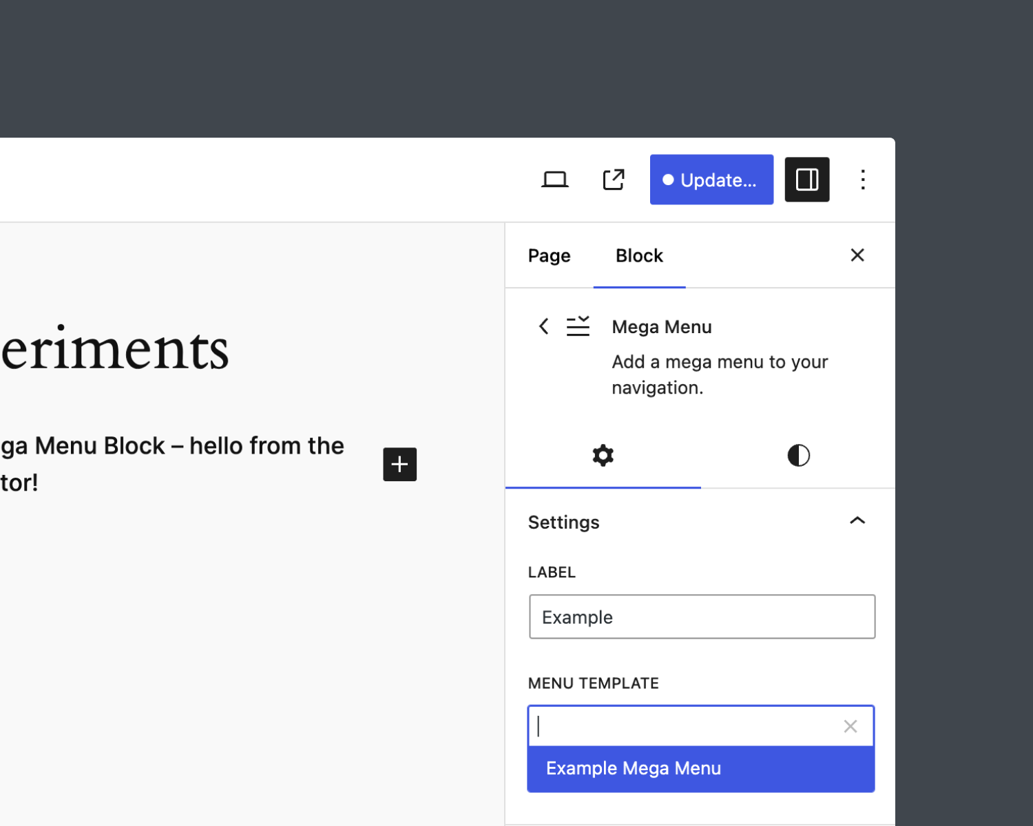
Next, let’s use the TextControl component to allow users to modify the label attribute and the ComboboxControl component to choose a menu template and set the menuSlug attribute.
Note that we are using setAttributes to update the values of both label and menuSlug based on user interaction.
After saving the edit.js file, the controls will be available in the Settings panel. Try modifying the Label and selecting a Menu Template. Confirm that the values are saved when updating the page.
While beyond the scope of this tutorial, if you plan to distribute this block to users, you will want to add some sort of notice if no menu template parts exist. Perhaps also provide a link that directs them to the Site Editor to create new templates.
Adding a RichText field in the canvas
While the label attribute is editable in the Settings Sidebar, this is not a great user experience. If you look at the code for the Navigation Link block in WordPress, you will see that the label is also editable using a RichText component in the Editor canvas.
Editing the Mega Menu block should feel as much like native WordPress as possible, and we don’t want to reinvent the wheel. Therefore, copy the same markup structure and CSS classes in the Navigation Link block and implement the RichText component. This allows our block to inherit Core styles and provide a consistent user interface.
Here’s a look at the RichText component once the above code is applied.
The Editor component for the Mega Menu block provides the basic functionality we need and is now complete. Let’s shift focus to the front end.
View the complete edit.js file
/**
* Retrieves the translation of text.
*
* @see https://developer.wordpress.org/block-editor/reference-guides/packages/packages-i18n/
*/
import { __ } from '@wordpress/i18n';
import {
InspectorControls,
RichText,
useBlockProps,
} from '@wordpress/block-editor';
import { ComboboxControl, PanelBody, TextControl } from '@wordpress/components';
import { useEntityRecords } from '@wordpress/core-data';
/**
* Lets webpack process CSS, SASS or SCSS files referenced in JavaScript files.
* Those files can contain any CSS code that gets applied to the editor.
*
* @see https://www.npmjs.com/package/@wordpress/scripts#using-css
*/
import './editor.scss';
/**
* The edit function describes the structure of your block in the context of the
* editor. This represents what the editor will render when the block is used.
*
* @see https://developer.wordpress.org/block-editor/reference-guides/block-api/block-edit-save/#edit
*
* @param {Object} props Properties passed to the function.
* @param {Object} props.attributes Available block attributes.
* @param {Function} props.setAttributes Function that updates individual attributes.
*
* @return {Element} Element to render.
*/
export default function Edit( { attributes, setAttributes } ) {
const { label, menuSlug } = attributes;
// Fetch all template parts.
const { hasResolved, records } = useEntityRecords(
'postType',
'wp_template_part',
{ per_page: -1 }
);
let menuOptions = [];
// Filter the template parts for those in the 'menu' area.
if ( hasResolved ) {
menuOptions = records
.filter( ( item ) => item.area === 'menu' )
.map( ( item ) => ( {
label: item.title.rendered,
value: item.slug,
} ) );
}
return (
<>
<InspectorControls>
<PanelBody
	title={ __( 'Settings', 'mega-menu-block' ) }
	initialOpen={ true }
>
	<TextControl
		label={ __( 'Label', 'mega-menu-block' ) }
		type="text"
		value={ label }
		onChange={ ( value ) =>
			setAttributes( { label: value } )
		}
		autoComplete="off"
	/>
	<ComboboxControl
		label={ __( 'Menu Template', 'mega-menu-block' ) }
		value={ menuSlug }
		options={ menuOptions }
		onChange={ ( slugValue ) =>
			setAttributes( { menuSlug: slugValue } )
		}
	/>
</PanelBody>
</InspectorControls>
<div { ...useBlockProps() }>
<a className="wp-block-navigation-item__content">
<RichText
identifier="label"
className="wp-block-navigation-item__label"
value={ label }
onChange={ ( labelValue ) =>
setAttributes( { label: labelValue } )
}
aria-label={ __(
'Mega menu link text',
'mega-menu-block'
) }
placeholder={ __( 'Add label…', 'mega-menu-block' ) }
allowedFormats={ [
'core/bold',
'core/italic',
'core/image',
'core/strikethrough',
] }
/>
</a>
</div>
</>
);
}
Configuring the front end
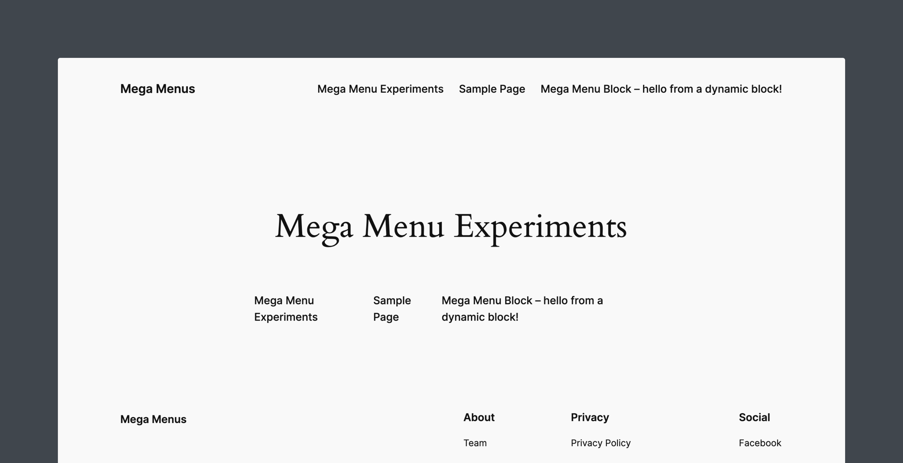
Following the steps above, the front end of the Mega Menu block should look like this.
The block is correctly displayed as part of the Navigation block, but the default output remains. Let’s fix this.
Updating the block markup and base styles
Navigate to the render.php file and assign the label and menuSlug attributes to variables. Add a check that returns null if neither exists. We don’t want to display a mega menu without a label or a label without a mega menu.
Finally, replace the default message with the menu label.
<?php
$label = esc_html( $attributes['label'] ?? '' );
$menu_slug = esc_attr( $attributes['menuSlug'] ?? '');
// Don't display the mega menu link if there is no label or no menu slug.
if ( ! $label